top of page


TopPage3
Client Think StartUp
Miro tools
Characters
Illustration
The idea was to illustrate a series of characters to use within tools in a platform called Miro to bring more personality to the brand and to make the tools more playful.


CONCEPT CREATION
Getting the right balance between playful characters and the existing clean and conservative tone of the brand was a big challenge for our illustrator. We run multiple rounds of sketches until we found the right style for the illustrations.


Lively moments to spark chats.
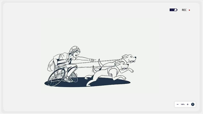
We created a series of 30 characters representing lively moments to make the tools more playful and to increase user's engagement.


FINAL COLLECTION

Walking dog Illustration

Runner Illustration

Artist Illustration
Walking dog Illustration
1/30


Illustrating all the way (and for all devices)
A crucial part of the project was to make all illustrations adjust to whichever device each user decides to open the tools.


CONCLUSION
This project has been a rewarding and challenging experience.
We are pleased with the final result and believe that our illustrations effectively capture the essence of the project. We hope that our work will inspire others, and we look forward to continuing to create meaningful and impactful illustrations in the future.

bottom of page